Residential
Dombivli
Interior Design
LUXURY + SIMPLICITY
SPEED + ACCURACY
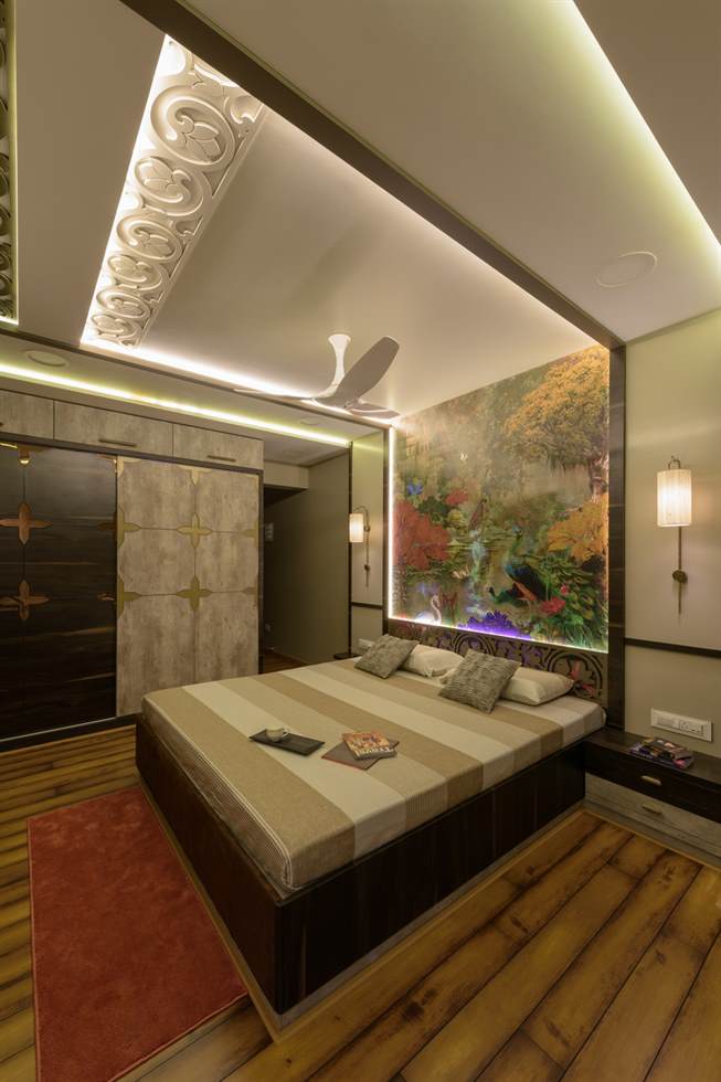
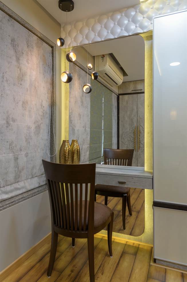
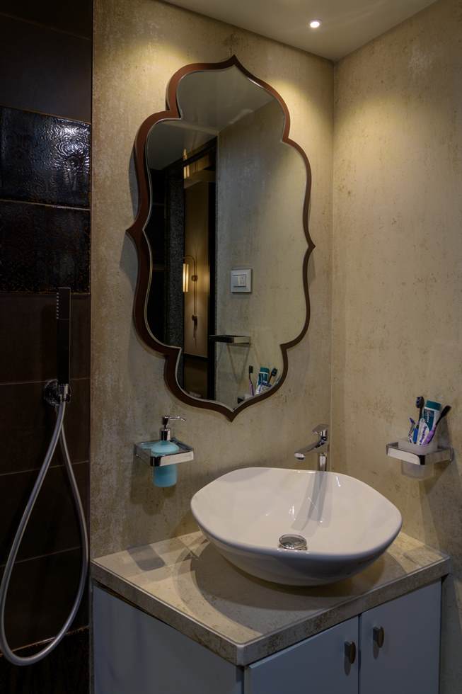
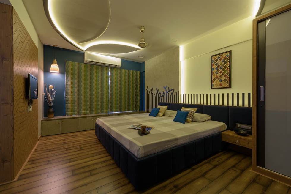
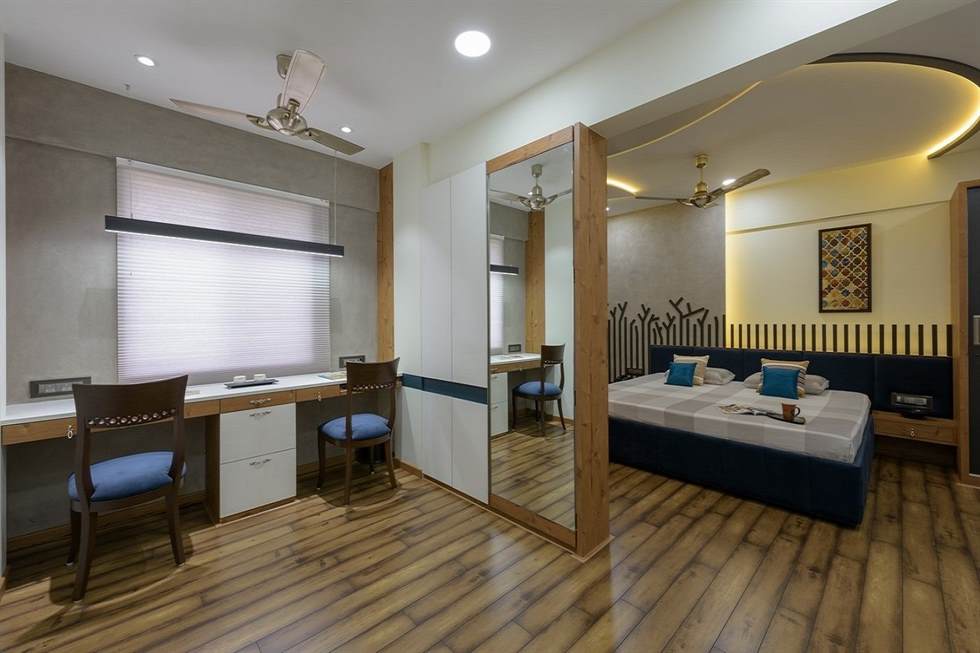
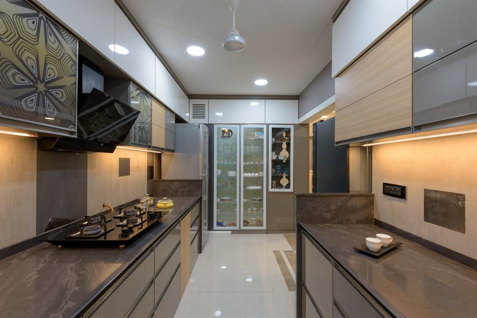
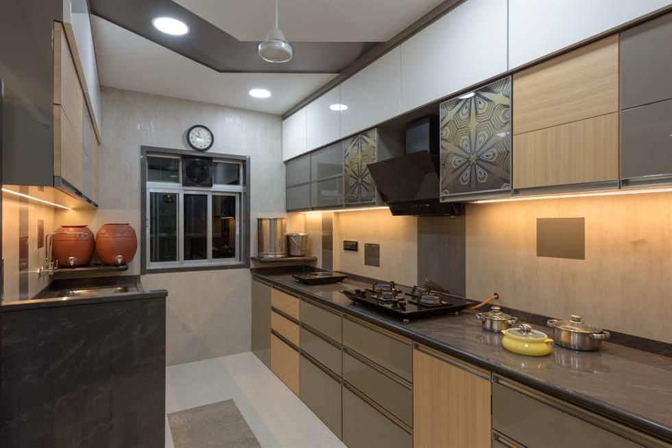
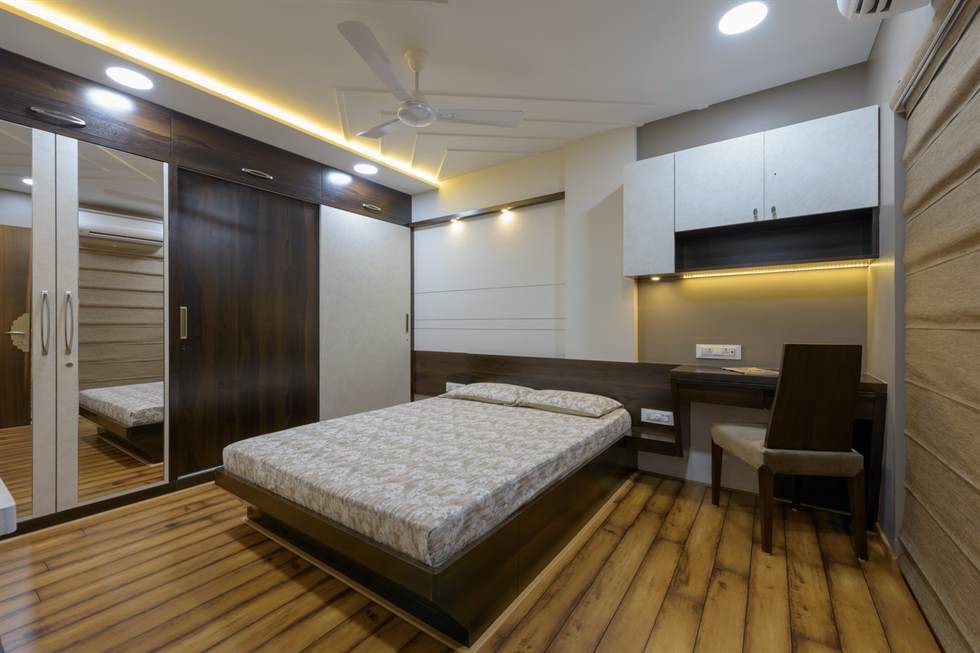
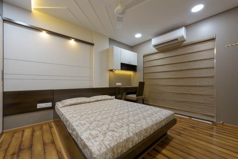
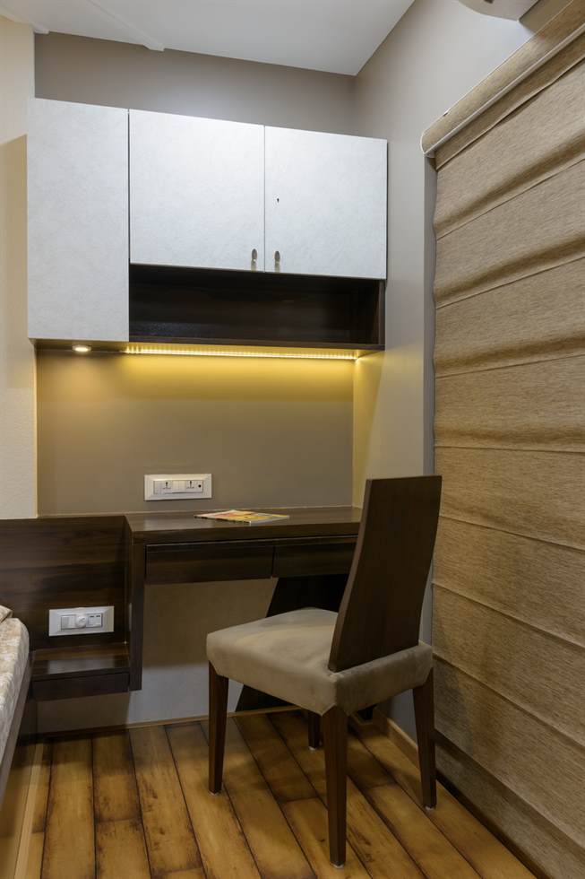
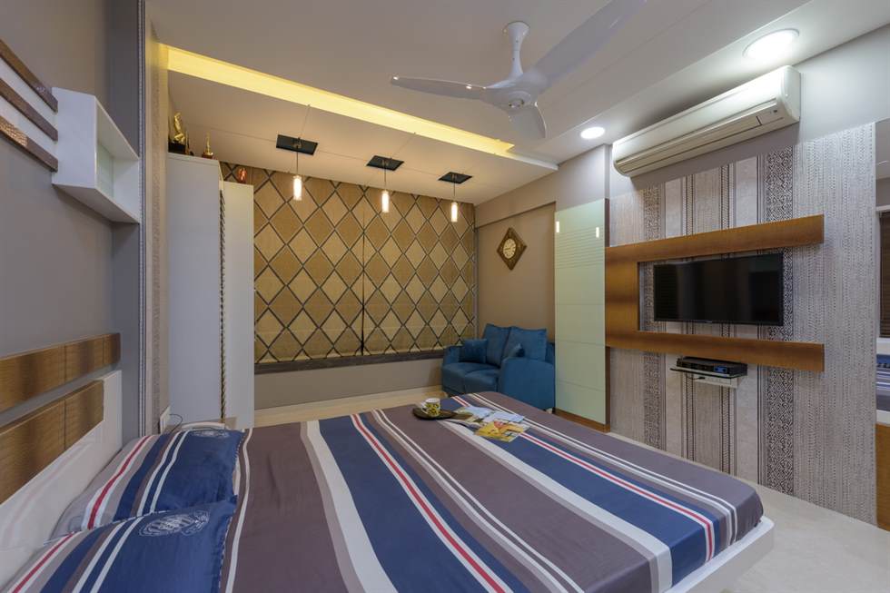
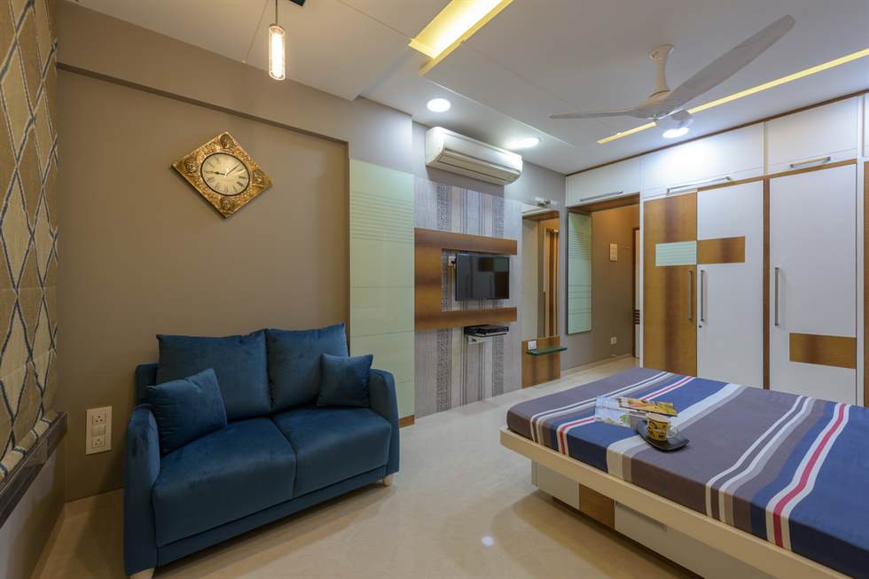
The Kothari Family needed a luxurious, minimalistic yet rustic palette for their home, which looked rich and gilded without looking eclectic, staying rooted to modernistic look.
The twist in the brief comes in the fact that they were planning to shift and stay here permanently. Speed with accuracy was of extreme importance while executing the project, without multiple retakes and reconsiderations. After a lot of discussions, the resultant idea was accepted as a whole within a month of working over the design, with minor changes, ready to be executed.
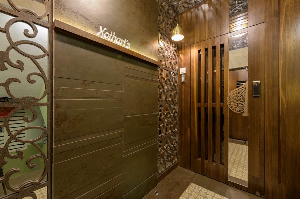
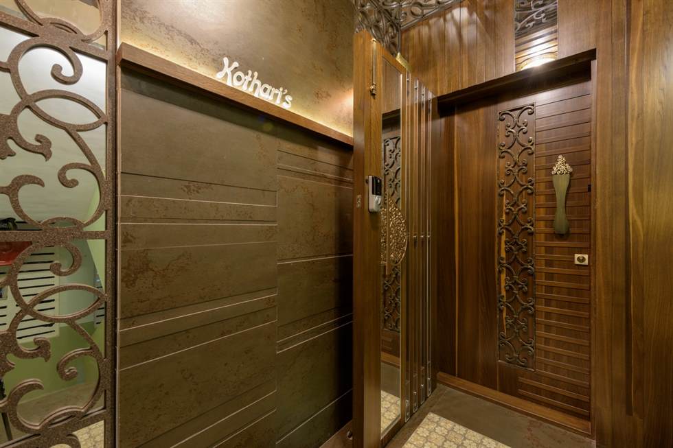
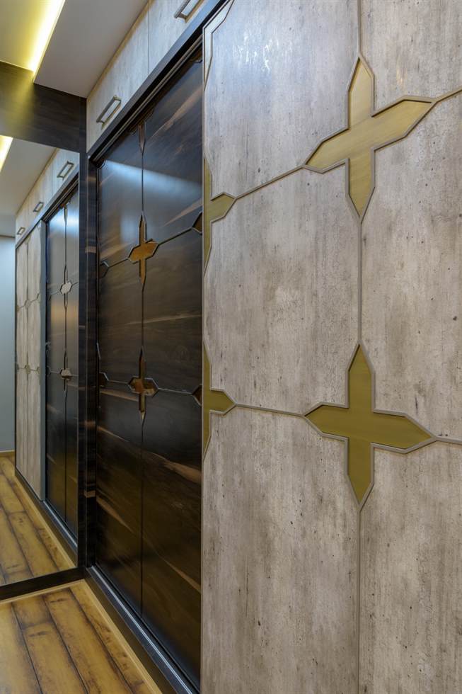
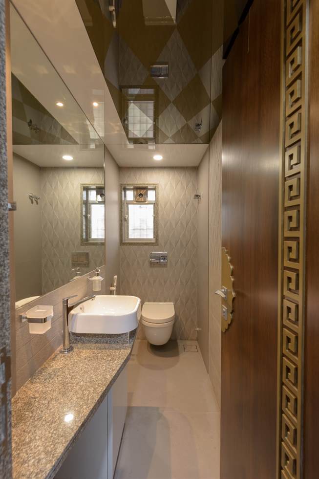
There are a host of geometric and intricate designs that are used at places time and over again to emphasise luxuriousness, one place at a time. These designs have different functions to them, apart from mere ornamentation. The door handle at the entrance, for instance, gives a good feel of craftsmanship and tastes, which the owner possesses. This introduces and reminds the visitors, new or old, of his profession and stature, at least on a surface level.
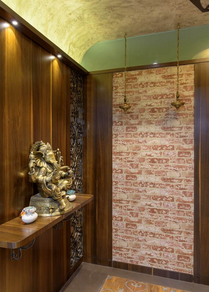
Visitor walking ahead is welcomed by a brass Ganesh idol sitting atop a wooden ledge, supported by a simple design made out of stainless steel with a rustic finish. This elevation is given depth with the use of mirror behind another metal decoration and a brick wallpaper in the adjacent wall, adding to the view of the entrance. The use of mirrors within the house gives it a depth, an illusion that the space is larger than it seems.
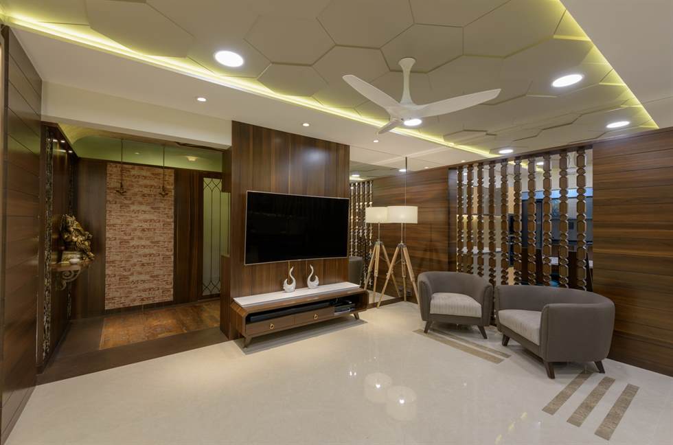
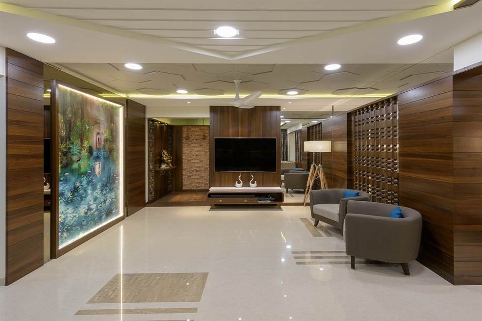
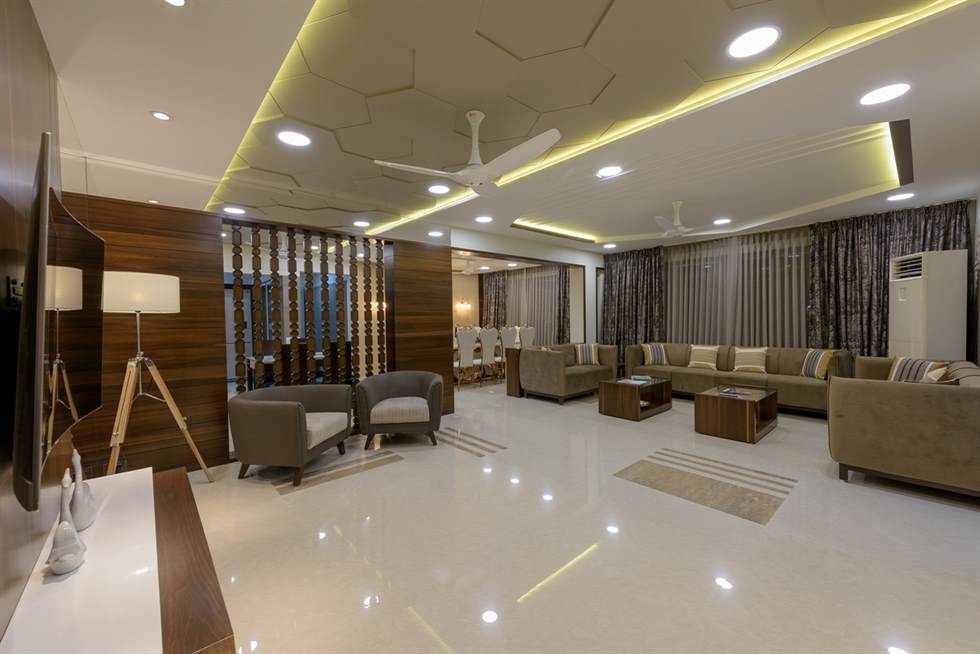
The overall colour scheme of beige, gold and neutrals are tastefully managed with colours of walls, furniture, accessories and upholsteries. The drawing room, especially manages the feeling of luxury and spaciousness with the right use of darker colours on the furniture and accessories, while the wall spaces and ceilings mostly white. The honeycombed false ceiling adds to the illumination, making it seem grander through and though.
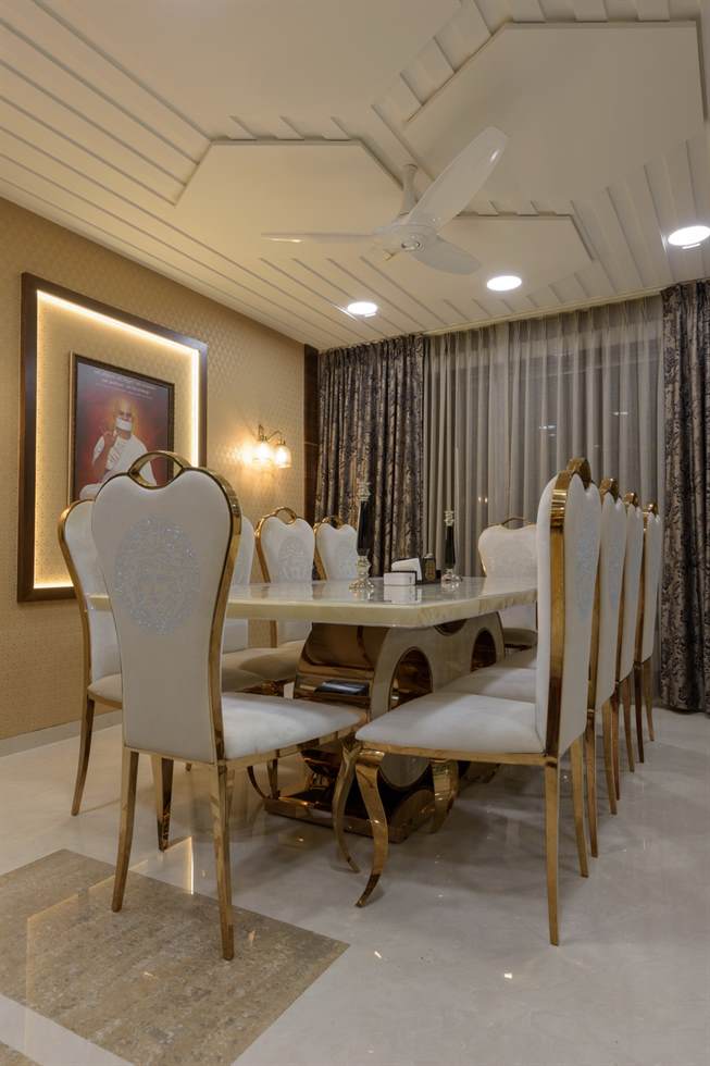
The distance between drawing room and dining room is connected openly, separated by chest of drawers for cutlery. The wall adjacent to dining table, where the portrait of their deity is set, shines upon them as the users have their dinner. The screening designed between drawing room and kitchen provides necessary privacy along with some transparency. These design decisions promote visual connectivity and fosters awareness of their surroundings and functions.
Mr. Rakesh Kothari said ‘the quality of the services provided by ‘The Pacific’ is top-notch. All the processes were relayed to us before taking a step. Our individual choices and designs were met perfectly by Miss Priya and Prashant Sir. The delivery time was really quick, compared to the usual interior designing projects’ execution period. We will definitely recommend ‘The Pacific’ to everyone for such a great service.’
“Awesome Teamwork. Awesome Vision. Perfect Implementation.”
– Rakesh Kothari
This simple yet beautiful output was executed within 4 months after the design proposal was accepted, ranging from making furniture to details of designs. In the times of great competition, where designer vies for interesting projects such as this, flipping a home should never cost home-owners’ their time. The phenomenon of ‘best results in less time’ is fulfilled throughout in this project.
Dombivali, Mumbai
Prashant Dudhe
2018
2164 Sq. Ft.
